In the lexicon of contemporary design, color is frequently relegated to the final stage of construction. It is viewed as a surface treatment, a decorative veneer applied to walls to satisfy the personal whims of an occupant. However, when one examines the work of masters who treat hue as a foundational building block, it becomes clear that color possesses a structural integrity equal to steel or stone. The most compelling residences are those where the palette is not merely applied, but integrated into the tectonic DNA of the house. This approach transforms the interior from a static container into a dynamic environment that governs the psychological state of its inhabitants.
The manipulation of color functions as a method of spatial definition. By deploying specific chromatic values, an architect can expand the perceived boundaries of a room or compress them to create a sense of cocooned intimacy. A cool, desaturated blue can cause a wall to recede visually, effectively borrowing space from the exterior landscape. Conversely, the use of warm, earthy pigments can bring the perimeter of a room inward, fostering a feeling of enclosure that mimics the security of a hearth. This is not about the application of paint; it is about the calibration of depth and distance through visual weight.
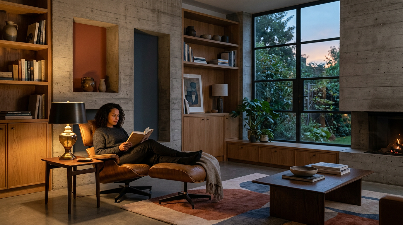
Consider the role of light in this equation. As the sun traverses the sky, the spectral quality of daylight shifts, interacting with the chosen pigments of a room to create a fluctuating narrative. A wall that appears muted and neutral at midday may reveal hidden undertones of ochre or violet as the light begins to wane. True architectural sophistication lies in anticipating these shifts, ensuring that the residence remains in constant dialogue with the changing conditions of the day. When the material palette is selected with an understanding of how light strikes a surface, the home becomes a living instrument, responsive to the natural cycles that define our existence.
The choice of materials must support this chromatic strategy. Natural stone, raw timber, and honed metals possess their own inherent color profiles, which act as the bedrock for any additional tonal layers. When a designer forces an aggressive or artificial color scheme onto these honest materials, the result is often a discordant tension that undermines the architectural intent. Instead, the most successful projects prioritize a harmonious relationship between the inherent color of the substrate and the applied layers of pigment. This creates a cohesive sensory experience where the eye can move through a space without encountering jarring transitions or visual noise.
Furthermore, color serves as a vital tool for establishing a rhythm of movement. Just as the transition between rooms can be choreographed through changes in elevation or ceiling height, it can also be articulated through subtle shifts in saturation. A transition from a light, airy atrium into a deeper, more saturated study creates a psychological pause, signaling a change in the intended function of the space. This use of color as a navigational device creates a narrative flow that feels intuitive rather than forced. It allows the architect to guide the occupant through the domestic landscape with a gentle, invisible hand, emphasizing the importance of specific zones while allowing others to fade into the background.
Ultimately, the architecture of color is an exploration of the human condition within the built environment. It asks us to consider how our surroundings influence our internal lives, and whether we are living in spaces that nourish our senses or merely provide a neutral backdrop for our daily routines. By moving beyond the superficial application of trends, architects can harness the power of tone and texture to create homes that are not only structurally sound but emotionally resonant. We must move toward a design philosophy that respects the profound impact of the spectrum, treating every square inch of a wall as an opportunity to shape the way we perceive our world and, by extension, ourselves.